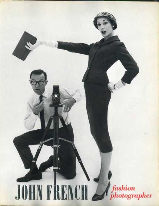
The British fashion photographer John French (1907–1966) has over the years, it seems, been reduced to a mere footnote in the biographies of the two most famous photographers he trained as his assistants, David Bailey and Terence Donovan. These were two among the many who passed through his studios and learned from him, including those listed at the end of this text. Not only did John French set a very high standard with his own work and create what was in effect “a school of fashion photography” in London, he also devised an ideal balance of tone and contrast that would reproduce well in newsprint. And that was a major breakthrough.
Before John French, British newspapers, for practical reasons, favoured fashion illustration over fashion photography. Techniques of reproduction for newsprint in the ‘50s were unsophisticated and the editors at the Daily Express, Daily Mail and other titles found themselves unable to do justice to photographs that turned sooty in production. Having learnt their lesson, they would default to fashion illustration.
The solutions that John French developed to overcome the limitations of the reproduction methods were based on a very specific set of skills he had picked up before he became a photographer. He attended Hornsey School of Art from 1926 to 1927, after which he worked for a period at a block-making firm where he gained technical knowledge of photographic reproduction in print. During the first half of the ’30s, he studied painting in Italy and was particularly interested in the qualities of light. In 1936, he joined Carlton Artists in London, where he worked as art director in the newly installed photographic studio, designing sets for advertising photography. From 1941 to 1946, he served as an officer in the Grenadier Guards, and took part in the initial landings of the Eighth Army in Sicily. After leaving the army in 1946, he returned to Carlton Artists, and then set up his own company in 1948.
John French would have an immense impact on British fashion photography. Following his death in 1966 from lymphoma, his wife, Vere French, donated his archive to the Victoria and Albert Museum, which presented an exhibition of his work in 1984, with an informative catalogue, still the principal reference source about him. Since then, he seems to have slipped further and further into the shadows, though vintage engraver’s prints by him will sometimes turn up in the British photography auctions.
I met up with fashion photography specialist Philippe Garner at his home in North London to discuss John French.
Most people when shown John French’s work today probably don’t realise that they’re looking at images that actually started a revolution.
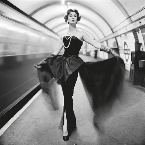
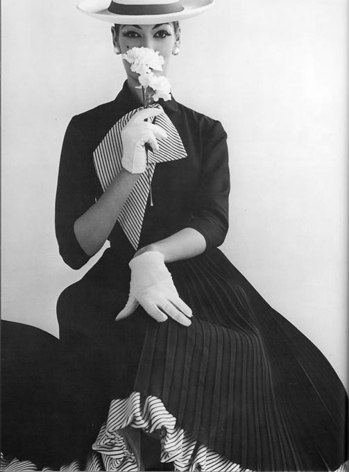
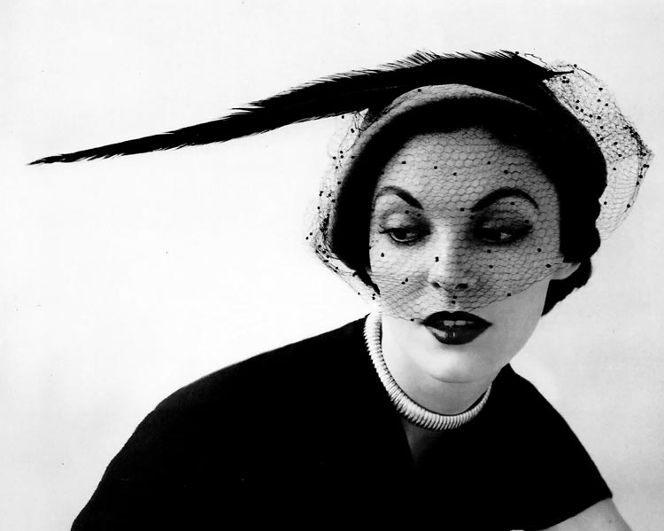
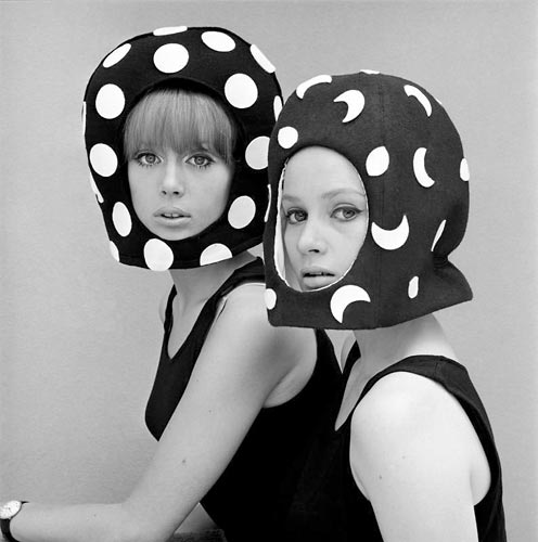
– John French occupies an important place in the story of fashion photography, certainly in British fashion photography. His professional years in that field straddle that transition between the look of fashion photography that one associates with the ’30s, ’40s and ’50s – the high elegance, remote, aristocratic call it what you will – and the explosion in the ’60s of youth culture, with a different focus, a different idea of beauty – younger, fresher, more dynamic. A revolution was happening at the time when he was active. Another dimension to keep in mind is that his photographs are rarely narrative pictures. He saw his first professional responsibility as showing off the clothes to their best advantage. In that respect, he was the ultimate professional fashion photographer. He didn’t use the fashion image as the scenario for telling his life story, exploring his deeper fantasies and imagination, or weaving fanciful romantic stories.
French’s images pack their punch precisely because of their essential simplicity; but this apparent simplicity was hard won, underpinned by the high technical standards that he set. His images have a distinctive clarity. They are sharp; they are crisp. He was a master of tone and contrast, understanding the limitations of the newsprint page and knowing precisely how to achieve the tonal range that would work perfectly in this context. Above all, he had an exceptional feeling for light. He just understood light; he knew how to create the light he favoured in the studio, very often using daylight. No British photographer can count on daylight, but French was able, when necessary, to create lighting that had the character of diffused daylight. He was a master in that respect. And passing through his studio, or studios – as he moved through different addresses – was a generation of photographers who learnt their craft from him and built their careers and their success on those craft skills, with that respect for clarity, tone, light. The most celebrated is David Bailey alongside Terence Donovan, but there were quite a number of other very able photographers who didn’t hit the reputational heights because they were, like John French, “jobbing photographers”, working within a particular discipline and not out to shakeup or shock the world with their ideas.
It has been claimed that he was the first to use bounced light. Was he?
– I don’t know. But there is a John French look in lighting for which I’m not aware of significant and consistent precedents. I think there was a tendency if one thinks back to the masters of ’30s and perhaps even going into the post-war years, that fashion photographs tended to be lit quite dramatically. Strong light sources, strong shadows, a degree of theatricality, which is the opposite of what he was after, the opposite of what he evolved.
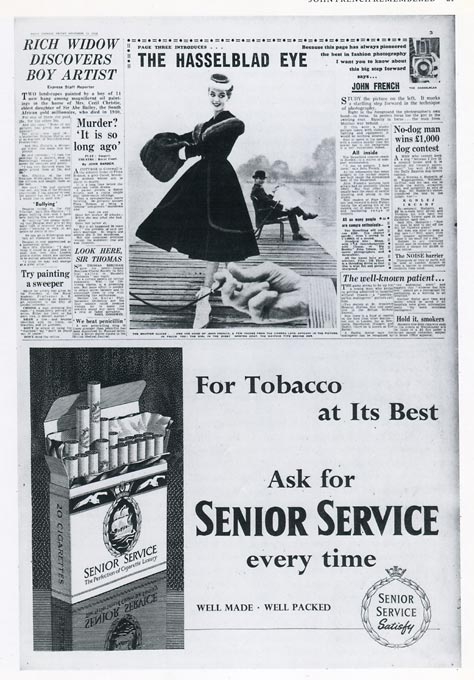
While fashion photography was published in British magazines, British newspapers gave fashion photography a miss, quite simply because they couldn’t reproduce it well and therefore used fashion illustration instead. But John French, because of his knowledge of block making for reproduction, his experience of art directing and building sets and his knowledge of light from having spent time drawing in sunny Italy, was able to reverse-engineer the whole thing, asking himself, “What is going to work for newsprint?”
– That’s exactly what he did and he opened up the possibilities of fashion in newsprint, which could have advantages over magazines. One being the very short deadlines. You could have a picture in the works within twenty-four hours. It could be topical; it could be light-hearted; newspapers could also deliver the Paris Collections very speedily. And fashion photography in newspapers would reach a huge audience, far greater than could magazines. The downside was that those images had a lifespan of only twenty-four hours, if that. They were seen, enjoyed, and discarded. Which is why I believe there’s still work to be done, bringing back into the canon the best of those photographers whose work was, for these reasons, so ephemeral.
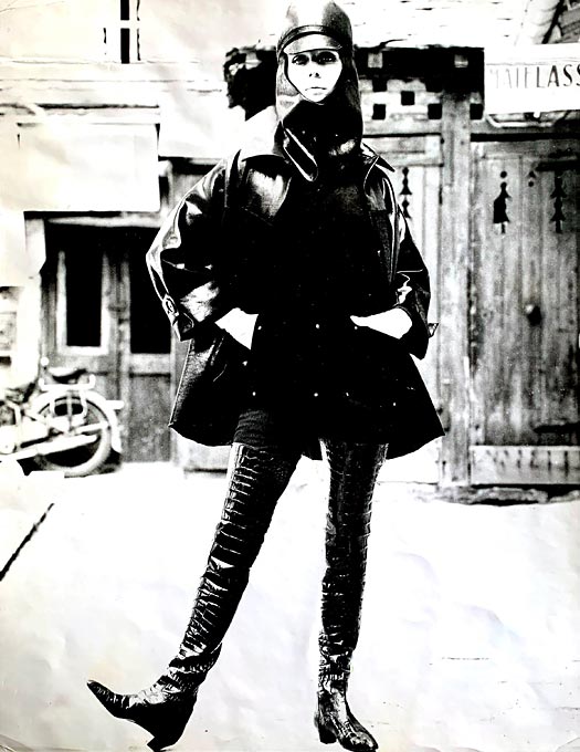
John French looked carefully at the clothes before he started shooting. I have met quite a few fashion photographers for whom the clothes were just a pretext for creating scenarios. He had a respect for fashion and when you look at his images, you can almost touch and feel the fabrics.
– The notion of elegance and stylishness mattered hugely to him. He was personally, an immensely stylish figure. He dressed quite formally. There was a certain studied crispness that characterised the most elegant gentlemen of the ’50s, going into the ’60s, before looser, casual looks became prevalent. He was the epitome of that disciplined look. He had a very stylish wife; and you’re right, one has a sense that he had a real feel for the fabrics, for the structure, for the form of the clothes. The garments are very well explained.
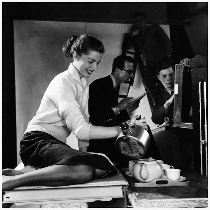
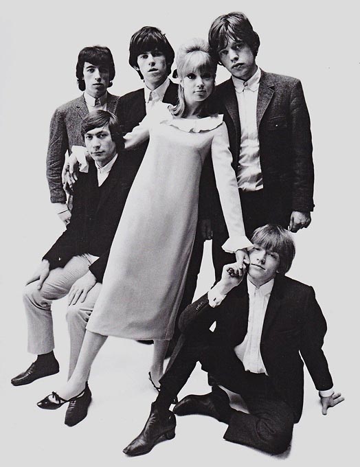
Another reason for his success seems to have been that he had the gift of making people feel at ease, making them feel welcome and he was extremely good at handling groups of models.
– Yes, one of his fortes were those set-piece groups of models or fashionable figures, which must have been quite challenging and demanding – structuring the group, positioning and posing each figure, ensuring everyone is engaged. Sadly, he’s gone and we can’t ask him the questions we would like to ask him but let’s not forget, he died in the mid ’60s, at which point fashion photography hadn’t even begun to try to claim its place within the more serious pantheon of the history of photography. It had tended to be marginalised, with the rare exceptions of say Edward Steichen or Man Ray, both of whom made great fashion images as one of their many endeavours. This particular discipline had not earned its Lettres de noblesse. And John French, if he could come back today and witness what has happened in the intervening years, would quite probably be staggered by what has been achieved in the field. He never had those high pretentions or expectations from his chosen profession.
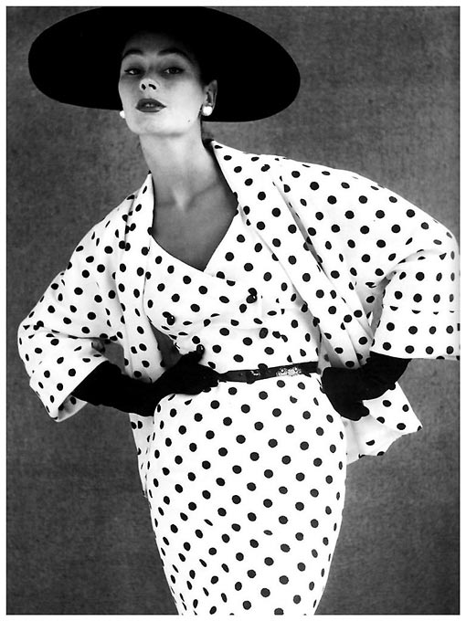
With his focus on the clothes. John French wasn’t burdened by say the classicism of Horst, or the Surrealism of Erwin Blumenfeld, both of whom found it very difficult to adapt to the new dynamic of the Sixties. John French managed the transition into the new young mood.
– Yes, there were photographers who were fully integrated in other areas of creativity and the arts, as you say, and indeed in high society. Horst, for instance, whose milieu embraced the chicest of the chic – among them Marie-Laure Vicomtesse de Noailles, Jean-Michel Frank, Jean Cocteau, Christian Bérard, and Coco Chanel. Horst was very much a part of that world and many of his ideas for fashion shoots emerged from that context. In the case of Blumenfeld, he drew on his early Dadaist days, influences from Surrealism and other sources and there is in everything Blumenfeld did, a layering, a depth; and when it came to fashion photography, yes, he showed the clothes but he was exploring a lot more besides. But John French didn’t have that agenda. It was pure photography of fashion, carried off with great skill and flair. There’s an elegance of line, an elegance of pose, and the models are at ease. He manages to combine effective graphic structure with a seemingly effortless choreography of his models. French is sadly underestimated as a photographer. It’s a shame; and I think that side of him we have discussed, as a mentor to a whole generation of fashion photographers is also significant and a worthwhile territory for investigation. There were quite a number of them – think of John Adriaan, Ronald Falloon, Murray Irving, Peter Rand, for example, a generation who knew how to use light against those white or mid-tone backgrounds. And let’s not forget that John French was a very exacting boss of the studios. He expected the highest standards of printing, and also, of finishing, which demanded the specialist skills of spotting, retouching, knifing.
On the subject of knifing. I was puzzled when I first came across it, the very fine cuts, in vintage prints by John French, and other British fashion photographers who worked during that period. I have only come across knifing in those prints, not in American or French prints from that time. I once asked the British master retoucher Peter Gamble about it and he said that back then, they used knifing because it was quicker than retouching with a brush.
– I also discussed it with someone who had learnt the skill, a photographer, Brad Branson, and he told me that they did it with a scalpel. I thought “Ouch! That sharp point must have been so tricky to use.” But he said, “No, no, we used scalpels with curved blades and used the curve of the scalpel to gently scrape away the emulsion.” And if somebody looked at the print in raking light, it didn’t matter. The print was a working tool. But the prints were of a very high standard. I met Charles Fiedler who was one of French’s printers and I remember his fastidiousness and his white lab coat, the embodiment of the John French studio. Another name I saw in the V&A catalogue was that of Terry Lack, who worked as a printer for John French. I’d like to know more about him and I hope that this article can work as a call for information. I associate Lack with the London Darkroom, which was in the Hatton Garden area, and with an agency called Hatton. His prints were of very high quality, double-weight black and white prints coming out of those darkrooms, and we can identify such prints being made, post-French, into the ’70s and beyond, by John French apprentices, his studio alumni. The standard size for John French prints was 12 x 16 inches. The conventional press print was 8 x 10 inches. I remember talking to a photographer who told me that in the ’70s, some of them went up to 16 x 20 inches because it gave them a competitive edge. If the print was bigger, it was more likely to attract the editor’s attention.
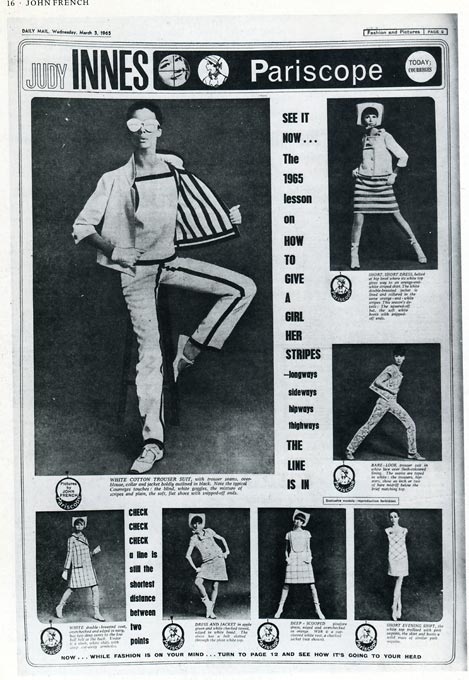
Today we are so used to see fashion from the ’50’s and ’60s from the perspective of what was published in Vogue and Harper’s Bazaar. But if you want to see what most people were wearing in the UK at that time, on trains, buses, and the London Underground, the styles sold by popular department store and high street shops, you need to look at the images John French took for British newspapers.
– Exactly, the highest of high in fashion was essentially the domain of just two magazines, Vogue and Harper’s Bazaar. The seasonal cycle around the Paris collections was key to everybody’s timetable and that was how it functioned.. Those ideas filtered down and eventually Italian fashion, American fashion, British fashion, all became part of an international fashion industry; but you’re right, there were more popular fashions, which didn’t get a look-in in the high-end magazines but they certainly did in newsprint, and they’re more likely to be what the greater proportion of women actually wore.
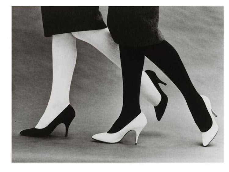
As you said, John French used white or grey backgrounds, and his grey army blanket was a firm favourite it seems. It appears in so many of his images and he could perform absolute miracles with it.
– Yes, and to me, his unassuming army blanket occupies a privileged place in the story of fashion photography, in the way that we might discuss with such great and deserved reverence Irving Penn’s old theatre backdrop that he used to such memorable effect in a daylight studio in Paris in 1950.
The John French studios
An alphabetical list of some of the people who worked in the studios (assistants, printers, retouchers, and administrators as well independent photographers who shared studio facilities): John Adriaan, Peter Akehurst, David Bailey, Evelyn Bannister, Janet Campbell, Terry Cleverley, Madeleine Constance, Paul Constance, John Cross, Neil Davenport, Terence Donovan, Brian Duke, Charles Fielder, Ronald Falloon, Georges Garçin, Terry Gibbons, Murray Irving, Kay Jemmett, Brian Jupe, Brian Kirley, Terry Lack, Paul Montri, Michael Murray, Martin Palmer, Basil Partridge, Sally Pasmore, Miss Roché (and her team of retouchers), Bert Shelton, John Stember, Michael Toll, Barry Warner and Gerald Wortman. (Reprinted from the 1984 V&A catalogue)
Should you have information on Terry Lack, please contact Michael Diemar:
All images from the V&A 1984 catalogue, John French – fashion photographer