Throughout the twentieth century, photography was fundamentally a paper-based medium, and photographic papers have played a crucial role in shaping the medium’s history and practice. However, little research has been done on how the material, technical, and visual properties of these papers impacted the work of photographers. This lack of scholarly attention stems partly from the difficulty of accessing and analyzing the physical characteristics of historical photographic papers.
To address this gap, the Lens Media Lab at Yale University’s Institute for the Preservation of Cultural Heritage has undertaken an extensive project to document and characterize its collection of over 7 500 dated and identified gelatin silver papers manufactured between 1890 and 2010. This is believed to be the largest collection of photographic paper samples in the world. Roughly one-third of the samples in the collection come from packages of photographic paper; the remaining two-thirds come from sample books published by manufacturers, and most of the samples in these books are printed photographs. From this collection, the lab has constructed a rich and comprehensive dataset that combines traditional catalog information with extensive material analyses.
The dataset includes, for each paper sample, detailed measurements of surface texture, gloss, base color, image color, thickness, and fluorescence to delineate the wide material variety of papers used by both professional and amateur photographers during the twentieth century. Also recorded for each paper sample are the manufacturer, brand, surface code, spatial dimensions, and year of manufacture (sometimes estimated or inferred); any resin coatings, toning agents, backprints, and processing instructions; and any language used by the manufacturer to describe the material properties that we measure: texture terms like “smooth”, “rough”, and “pebbled”; color terms like “white”, “cream”, and “ivory”; reflectance terms like “glossy”, “matte”, and “luster”; and designations of paper thickness, usually “single weight” or “double weight”.
The lab has done extensive imaging of the collection as well, including microscopic images of the paper surfaces; high-resolution digital images of any paper packages, sample book photographs, and backprints; and scans of any processing instructions. This rich trove of data is now made publicly accessible through Paperbase, a new web-based research platform developed by the Lens Media Lab.
By providing access to this unique dataset through Paperbase, the Lens Media Lab seeks to catalyze new approaches to characterizing the material practices of twentieth-century photographers. Moreover, Paperbase will enable researchers to chart the evolution of paper-based photographic technologies, such as the introduction of optical brightening agents and resin coatings, and to better understand how the language used to describe photographic papers, including widespread terms like “white” and “glossy” changed over time.
The Paperbase Application
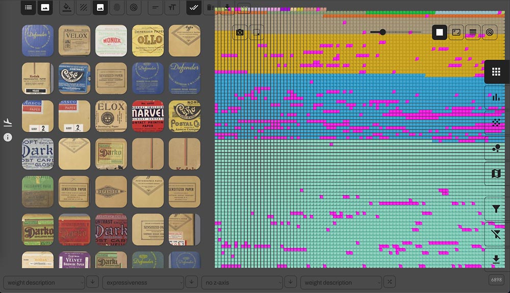
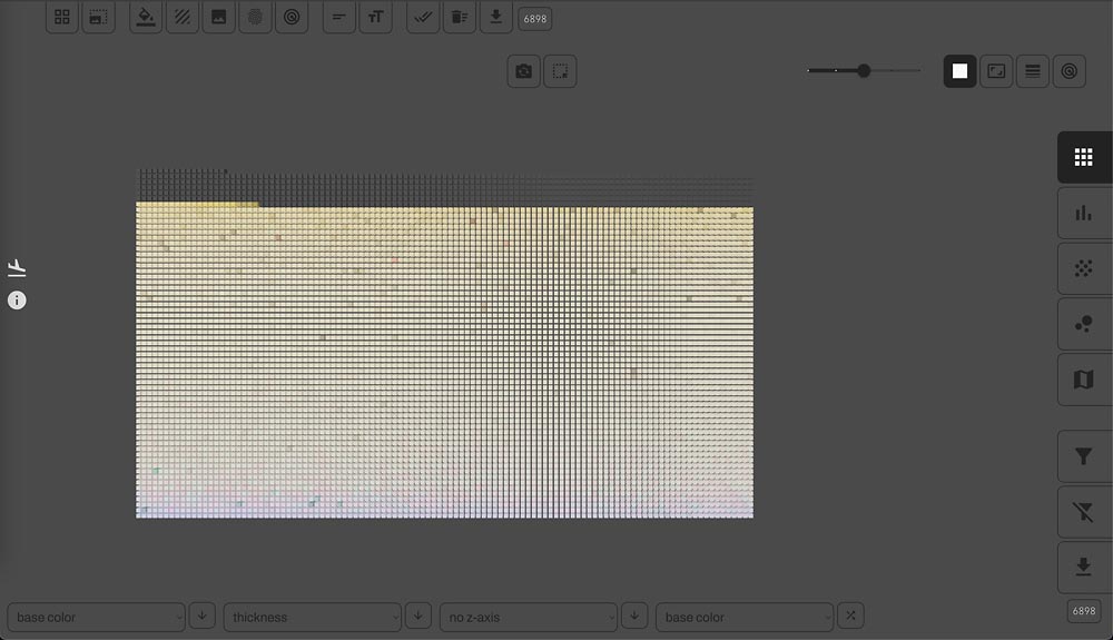
So what is Paperbase, exactly? Paperbase is a complex, interactive data visualization of the lab’s paper collection, comprising three distinct but concurrently viewable visualization layers. When you first open the application, you see the first layer: the entire collection rendered as a grid of tiny cubes in a 3D canvas, each cube colored by the base color of the photographic paper it represents. In this way, Paperbase is quite unlike traditional collections viewers, the sort you’d see on a museum website.
In a traditional collections viewer, only a small fraction of the collection is typically rendered on the screen at any time, and users have to click through sometimes hundreds of pages to see it all. Paperbase is different, because we want users to be able to see patterns across our entire collection. When the application first loads, one such pattern is already visible: the distribution of base colors across the collection. Many other such patterns can be surfaced using the controls that surround the canvas, and we will discuss examples of these.
But Paperbase is designed for more than just “distant reading” of collection-scale patterns. Like a traditional collections viewer, Paperbase makes it possible to do “close reading” of individual collection items. Any item can be clicked to reveal additional information in the selection panel, the application’s second visualization layer, which floats atop the main canvas. Any number of items can be added to the panel either by clicking, filtering, or by dragging a box around the points of interest.
Once the panel is populated with items, the user can modify the visual presentation of these items to reveal additional information about the paper samples represented, including any of the image assets associated with the items – package images, texture micrographs, backprints, etc. If a deeper look at a panel item is desired, users can click to open any item into a full screen view, and from there, links to processing instructions, backprints, and even external collection records hosted on Yale’s LUX platform can be opened in new browser tabs.
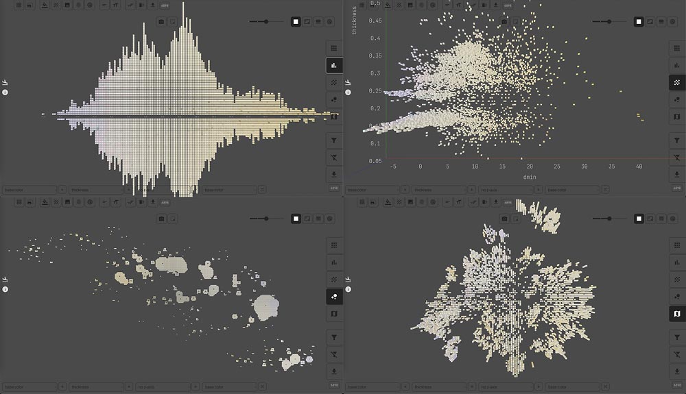
In this way, Paperbase makes it possible simultaneously to see patterns across the collection and to identify the individual items responsible for those patterns. So, how do we surface patterns in the data? There are, broadly speaking, two ways to begin your search. The first is by ordering and coloring the canvas items and adjusting the canvas layout using the bottom menus and the layout buttons along the right edge of the screen. Canvas items can be laid out in a grid, a histogram, a scatterplot, a texture map, or a cluster plot, each one suited to different analytical goals. If, for example, you want to see collection items ordered by a single variable (e.g., color) in as compact a layout as possible, use a grid. If you want to see the distribution of a single variable, use a histogram.
If you want to understand the relationship between two or three variables, use either a 2D or 3D scatterplot. If your focus is texture, use the texture map, which reveals a texture “geography” of photographic paper surfaces. And if you want to explore overall material similarity, taking into account gloss, texture, color, and thickness together, use the cluster plot.
For many analytical goals, you’ll want to use a mixture of these. Any variable – continuous, numerical variables like gloss and color as well as categorical variables like manufacturer – can be mapped to any axis, and canvas items can likewise be colored by any of these variables as well. This flexibility makes possible hundreds of thousands of distinct views on the data. No single investigation will cover a significant fraction of these views, of course, but seeing the collection under as many relevant views as possible is the best way to understand it and to generate accurate explanations of the patterns you’re seeing.
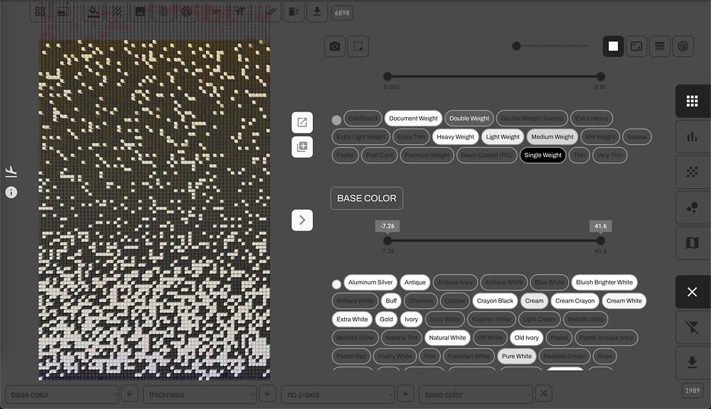
The second way to begin your pattern search is by filtering the data using the filter panel, the application’s third visualization layer. This will likely be the starting place for most folks, because it allows you to constrain your search to the subset of collection items relevant to your interests. You might, for example, be a photographer interested in resin-coated papers, or a historian doing research on the company history of Kodak, or a conservator interested in color changes over time.
Each of these investigations can begin with a selection of filters. Because the filter panel is itself a visualization layer, you can even do significant research within the filter panel itself. Each filter button is wired to a particular variable value in the data – the value “Kodak” for the variable “manufacturer”, for example – and is assigned a color from white to black that represents the frequency of that value in the data. White is low and black is high, so the “Kodak” button is quite black: Kodak papers have the highest frequency among all manufacturers in the collection. Once you click a filter button, every other button in the panel will update its color to reflect the application of the filter. If, for example, you click “Kodak”, then the buttons associated with any non-Kodak brands will become transparent, and the remaining buttons will now show the relative frequencies of all of Kodak’s brand offerings.
Vignettes
This was a rapid tour of Paperbase’s core affordances, and we had to skip a lot. But the best way to understand the power of the tool is to consider how different features interact. For the remainder of the article, we will focus on a handful of illuminating examples that show multiple features working together to produce useful views on the collection.
Texture Map
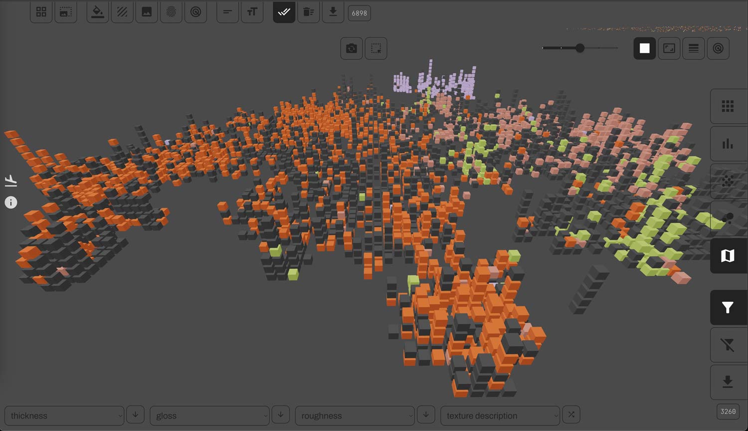
If we choose the “texture map” layout, we get a topographic map of the texture universe of photographic paper. If paper samples have similar textures, they will be near each other on the map. When many samples share the same texture, they are stacked at that texture’s map location, and this creates a variety of stack heights, making the map seem like a landscape. One useful analytical approach is to color the map items by their texture description – manufacturer terms like “smooth”, “rough”, “fine grained”, and “silk”.
You can filter for the set of terms you’re interested in, and then observe their spread across the map. Note that these are two quite distinct sources of texture information: one is derived from, essentially, advertising language, and the other from direct physical measurement. Because of this, we might see material overlap between distinct texture terms, some terms might be more spatially localized or diffuse than others, and we might discover unexpected neighbors. Paperbase makes these patterns easy to see at a glance.
Tone
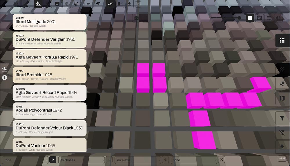
Our color analyses typically focus on “base color”, which is the color of the paper support – typically some variant of white – but photographs also have a second color, the color of the image material. This is metallic silver, and
although it will usually appear approximately black, there is nonetheless a great deal of tonal variation in these “blacks”, and Paperbase makes it possible to see these colors directly, by mapping them to the color of the canvas cubes. As you find tone colors of interest, you can click them, which adds them to the selection panel where you can see their catalog information. Additionally, you can color the background of the panel tiles by the base color of the selected samples and thereby see both sample colors together in the same view.
Material Space
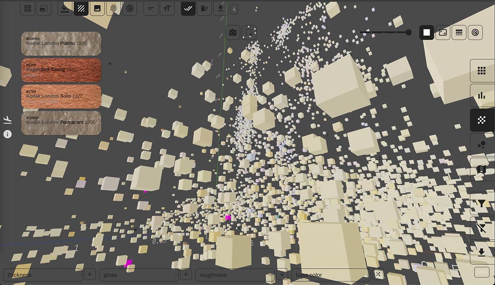
Our core analyses use four material dimensions: thickness, roughness, gloss, and base color. The closest you can come to inhabiting this material space is to map thickness, gloss, and roughness to the axes of a 3D scatterplot, and to map base color to the color of the canvas cubes. You can use zooming, panning, and rotation to change your vantage point in this space, and after some time, you better understand its shape.
This exploration process will not, of course, yield precise statistical measures of the relationships between these variables, but it will give you a feel for the material variety in the collection, something you’d be unable to obtain without an interactive, 3D visualization canvas. Where are there high densities of samples? Which areas are empty? Is the collection a contiguous mass, or a scattered archipelago? All of these questions can be answered via direct experience, using Paperbase.
Backprint K04
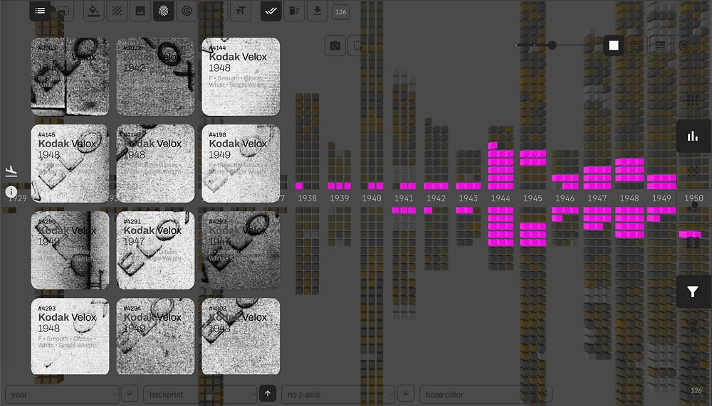
Some manufacturers use backprints – company and brand logos printed on the backsides of photographic papers – to identify their products, differentiate product offerings over time, and even to indicate specific material properties like gloss. We’ve done extensive research and cataloging of these backprints, and have even created a system of backprint codes to identify them. The most common backprint in our collection is “K04”, used by Kodak for their Velox brand. We have 126 occurrences of K04 in our collection, most of them from the 1940s.
We can filter for K04 in the filter panel, and then, using the “add filter to selection” button, we can add the items satisfying this filter to the selection panel, where we can observe the backprint images themselves. If we switch the canvas layout to a histogram, and map the year of manufacture to the histogram axis, we can see the initial appearance and eventual disappearance of the backprint, and we can link the two representations by clicking the selection panel items and seeing where they jump up in the canvas. If a closer look at any backprint image is desired, we can open them in full screen view and toggle through them with the arrow keys. Full size images will open in a new tab on click.
Surface Y
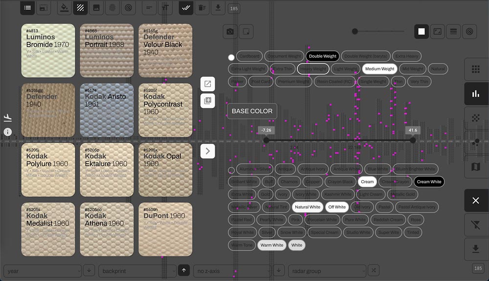
Photographic paper manufacturers differentiate their products in (at least) two distinct ways: there are brands, which can vary materially but usually contain the same tones and contrast grades; and there are surfaces – specific configurations of base color, gloss, and texture. Surfaces can, and often were, shared across different brands, and there are even surfaces that – I dare say – are shared across manufacturers. One such surface is Y, whose texture is usually called “silk” and has a very distinctive look: a tight pattern of small circular bumps, quite consistent across manufacturers.
You’re not likely to see a modern paper with a silk texture, but they were popular in the ’40s, ’50s, and ’60s, and even lasted into the ’70s, appearing for the last time in our collection in 1979. You can witness this history using a “year of manufacture” histogram, after filtering for surface Y in the filter panel. Scrolling through the panel will allow you to see which other material properties are typically associated with this surface—e.g., double weight, cream or “natural white” color, luster finish, etc. This view on the collection would be an excellent starting point for a history of this particular paper surface.
Fluorescence
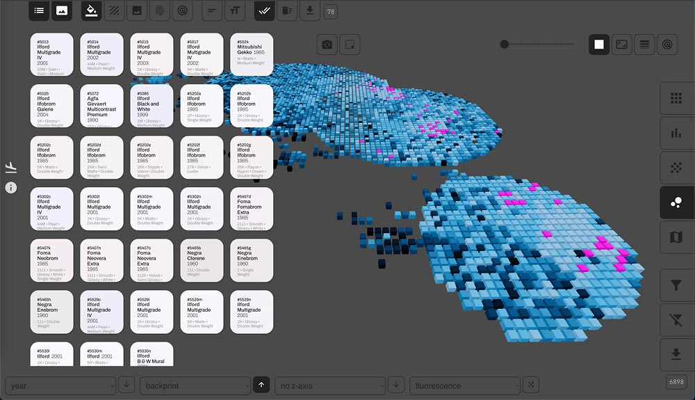
Starting in the 1950s, paper manufacturers used additives – called “optical brightening agents”, or OBAs – to photographic papers to make them appear whiter. But manufacturers were pretty guarded about the exact nature of these processes – viewing them as important trade secrets – and would rarely reveal which papers contained OBAs at all. There are some giveaways, though: any paper described as “brilliant white” is likely to have OBAs, for example. But we have a better way of finding brightened papers: our color measurements are taken using a spectrophotometer, and ours takes color captures under both UV-included and UV-excluded illumination conditions.
If the paper is fluorescing as the result of OBA additives, the spectral curves under these distinct conditions will differ considerably in the intensities of the blue wavelengths of the spectrum. The area between the curves serves as a measure of fluorescence. Let’s say we want to track the most extreme cases of fluorescence across our collection to see what else we can learn about these papers. First, we will filter for high fluorescence using the fluorescence slider in the filter panel. We can then observe the spread of high-fluorescing papers across our material universe using a tight cluster plot. If we add the filtered papers to the selection panel, we can look at their base colors, all of which should be pure white at the least, and even tilting towards blue in the most extreme cases.
Vintage Package Images
Our collection contains stunning imagery of our photographic paper packages, and these images can be explored in Paperbase. Let’s say we are interested in early package design, from the 1890s through the 1940s. We can adjust the year slider in the filer panel to obtain this subset of papers, and then we can add them to the selection panel, where we can see thumbnail, cropped versions of the images. We can also toggle through full screen images using the arrow keys in the detail screen, and full-size images can be opened in new tabs by clicking.
We can track additional information about these paper samples alongside the selection panel. Say, for example, that we want to better understand the variety of paper weights during this period of time. We can color the canvas cubes by weight description, sort a grid layout by the same variable, and our selected papers will appear as magenta highlights in the canvas. The ability to see multiple transformations of the data together in the same view makes Paperbase unique among collections platforms, and promises to open up new avenues for art historical and conservation research in photography.
