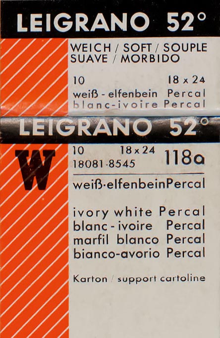
A photograph is more than an image. Paper, the physical material of the photographer, plays a vital role in the appearance of a photographic print and in conveying the photographer’s intention for it. Texture, gloss, highlight color, and sheet thickness — the defining characteristics of photographic paper — each contribute significantly to the visual impact of a print. Paper manufacturers have long manipulated these key characteristics, singly and in combination, to differentiate their products and to satisfy a broad spectrum of market demands. By the early 1920s, these features were routinely described in marketing materials, sample books, and, most importantly for a working darkroom photographer, directly on the packages of papers themselves (fig. 1). Knowledge of this specialized vocabulary became increasingly essential in the 1920s and 1930s as photographers sought to navigate an unprecedented diversity of gelatin silver papers.1For more information on the history of gelatin silver papers, see Paul Messier, “Les Emulsion industrielles,” in Anne Cartier-Bresson, ed., Le Vocabulaire technique de la photographie (Paris: Les Editions Marval, 2008), pp. 454–56. The intuitive understanding of the expressive potential of various papers that many photographers gleaned through experience was increasingly made explicit in technical manuals and literature produced by manufacturers, such as in an instructional chart distributed by Kodak in the mid-1930s (fig. 2).
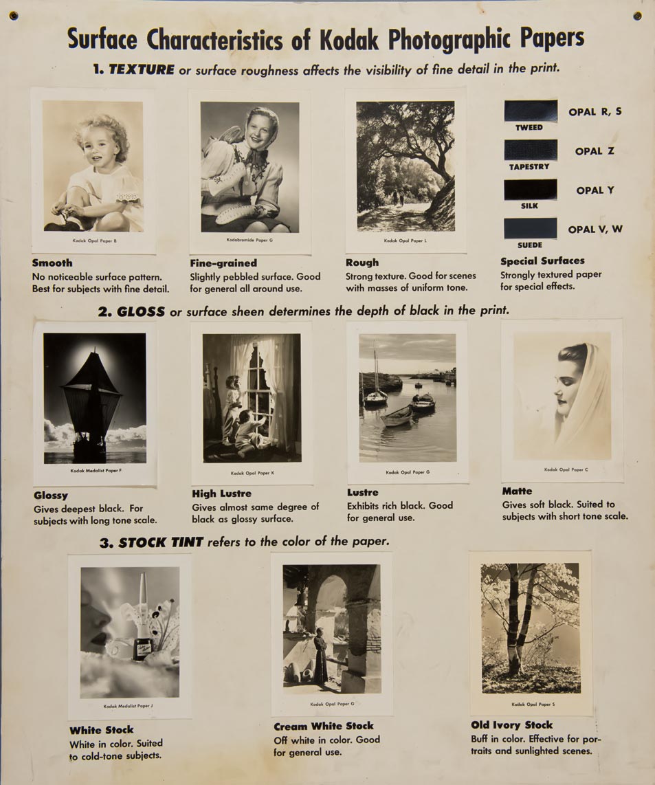
Such summaries communicate in broad strokes a range of qualities and effects for the key paper characteristics. For instance, smooth surfaces are ideal for conveying detail, while coarse textures add visual interest to compositions that incorporate broad, uniform tones. These “rough” surfaces are also useful for breaking up and generalizing detail. Surface sheen, meanwhile, ranges from glossy, which provides optically saturated, deeper blacks, to matte, which is best for subjects with lower contrast and less tonal range. Matte surfaces also inhibit specular reflections and are therefore a good choice for display. A paper color might be neutral white, which, as the Kodak chart explains, is “suited to cold-tone subjects”; used in conjunction with smooth, glossy surfaces, neutral white papers are ideal for documentary purposes. On the other end of the spectrum, warmer papers are better for evocative subjects such as “portraits and sunlighted scenes.” Thickness of the paper base (not included on the Kodak chart) also carries certain implications. A thin base paper, often less expensive, might be said to communicate a practical, purpose-driven expression. A thick paper base makes for a more assertive physical presence and suggests greater intrinsic value.
Combined, these principal components could be used to create what we might call “expressive” papers on one end of the spectrum and “functional” papers on the other. An expressive paper — rough, matte, warm-toned, and thick — signals interpretive subjectivity. A functional paper — smooth, glossy, white, and thin — projects objective reality through an implied conveyance of documentary fact. Throughout the twentieth century, black-and-white printers and paper manufacturers explored these two poles and the nearly infinite terrain in-between.
Understanding the variety of photographic papers available and how their material characteristics functioned to suit the intentions and needs of photographers serves as the necessary first step in deciphering the message encoded in texture, gloss, color, and base thickness. To gain deeper insight into a photographer’s intention for a specific print, of course, the paper itself must be examined closely. Because each of the material characteristics of photographic paper can be measured, not only can we uncover additional information about a photographer’s ambitions for individual photographs but these measurements can provide a platform for discovering material-based similarities and differences among prints across certain collections.
Such was the case with an experiment that involved ten image pairs selected from duplicate prints present in both the Thomas Walther Collection at The Museum of Modern Art and the photography collection of the Museum of Fine Arts, Houston (MFAH). Each pair of photographs shows the same or a very similar image and is attributed to the same photographer.2There is one exception. Lowe in His Shadow (MFAH 2002.1556) is attributed by its owner to Edmund Collein only. MoMA’s print of the same image (MoMA 1658.2001) is signed on the verso by both Collein and Heinz Loew. On the basis of this evidence, MoMA considers this playful portrait a collaboration of both photographers. The ten pairs, shown to scale in figure 3 (following pages), reveal differences in cropping, dimensions, and color between most pairs. These distinctions, along with variations in titles and dates across the two museum catalogues, provide ample reason to question whether or not the paired prints share the same or a substantially different material history, and thus were the product of different intentions on the part of the photographer.
Texture, gloss, base color, and paper thickness were measured for each print. To avoid comparative bias, measurements were made separately at each institution, and the prints were never examined together side by side.3The author gratefully acknowledges the assistance of the following conservators, who played a critical role in gathering data for this study: Hanako Murata, Assistant Conservator of Photographs for the Walther Collection research project; Toshiaki Koseki, Carol Crow Conservator of Photographs at the Museum of Fine Arts, Houston; and Jennifer McGlinchey, Conservator of Photographs with Paul Messier LLC. These measurements were then compared to determine whether the paper was the same or different. For gloss, color, and thickness, the measurement techniques are routinely straightforward. The measuring of paper thickness, for example, was carried out with a micrometer, color with a spectrophotometer, and gloss with a glossmeter. (Details regarding measurement techniques and tools are described in the Appendix below.)
fig. 3 (pages 3,4) The prints of ten identical or very similar photographs in the collections of the Museum of Fine Arts, Houston (left), and The Museum of Modern Art, New York (right). Shown to scale. © Marianne Breslauer/Fotostiftung Schweiz, © 2014 Max Burchartz/Artists Rights Society (ARS), New York/VG Bild- Kunst, Bonn, © Paul Citroën/Artist Rights Society (ARS), New York/Pictoright, Amsterdam, © Ursula Kirsten-Collein, © Miloslava Rupesova, © 1998 Center For Creative Photography, Arizona Board of Regents, © Estate Helmar Lerski, Museum Folkwang, Essen, © Estate Franz Roh, Munich, © Estate of Theodore Roszak/Licensed by VAGA, New York, NY
Measuring texture required something new. As part of the Walther Collection research project, the “Historic Photographic Paper Challenge” was initiated to invent new methods for characterizing and indexing the textures found on gelatin silver photographs.4C. Richard Johnson, Paul Messier, et al., “Pursuing Automated Classification of Historic Photographic Papers from Raking Light Images,” Journal of the American Institute for Conservation 53, no. 3 (2014): 159–70. Four university teams accepted the challenge, and work began by assessing options for collecting texture data.5The four teams were: William Sethares at the University of Wisconsin– Madison; Andrew Klein, Christopher Brown, Anh Hoang Do, and Phillip Klausmeyer at the Worcester Polytechnic Institute, Worcester, Mass.; Patrice Abry, Nelly Pustelnik, and Stéphane Roux at the École Normale Superieure de Lyon, Stéphane Jaffard at the University of Paris, and Herwig Wendt at the Institute de Recherche en Informatique de Toulouse, Centre National de la Recherche Scientifique; and Nanne van Noord, Laurens van der Maaten, and Eric Postma at Tilburg University, the Netherlands. The first prerequisite was that the methods needed to be noncontact and repeatable. With an eye toward eventual wide-scale deployment, simple and inexpensive techniques were given higher priority. Ultimately, a microscopy-based imaging system designed to illuminate surface features with a low-angle raking light was selected. Each team then used images made from this system to develop different algorithms to discover affinities among textures and to sort the papers accordingly. The algorithms were successfully tested on reference samples of photographic paper, with each showing comparable levels of discrimination. To compare paired prints from the collections of MoMA and the MFAH, an adaptation of area-scale fractal analysis proved particularly useful, since it produces relative area measurements at increasing scales of observation.6 C. A. Brown, P. D. Charles, W. A. Johnsen, and S. Chesters, “Fractal Analysis of Topographic Data by the Patchwork Method,” Wear 161, nos. 1–2 (April 1993): 61–67. Thus, meaningful comparisons may be made by selecting the size of the surface area that provides the most useful level of discrimination.
Quantifying the key attributes of texture, gloss, color, and thickness also presented an opportunity to objectively examine the semantics traditionally associated with the material characteristics of photographic paper. What does a manufacturer mean, for example, in marketing a certain paper as “glossy,” or “rough,” or “cream?” No measurement-based standards have ever existed to define such terms. Thus, the same four measuring techniques described above were applied to broad segments of the author’s reference collection of historic samples of gelatin silver paper dating from 1895 to 2012, with an effort made to distribute the samples as evenly as possible across the decades from 1900 to 2000.7The reference collection and its characterization are described in some detail in Messier, “Photographic Papers in the 20th Century: Methodologies for Research Authentication and Dating,” submitted to the post-print publication of FotoConservación 2011, Logroño, Spain (in press). Draft available at http://paulmessier.com/pm/ pdf/papers/fotoconservacion_ paul_messier_2011.pdf. Surface texture was measured on 2,031 papers; gloss and highlight color were assessed on 300 papers; and paper thickness was measured on 1,651 samples. In each case, the measured values were compared to the semantic descriptions applied by the manufacturers for each of the four features. The results of this work are presented in figure 4, which shows the measurement-based criteria that were selected to define the historical terms used in this analysis.8The definitions developed and presented in figure 4 usefully illustrate the potential for classifying texture, gloss, color, and thickness. However, this work is not intended to be the last word on this subject. Any de facto standards for categorizing such measurements will emerge over time through a consensus within the field of photograph conservation. In particular, the concept of a “texture index” is still very much in a formative stage and, more than likely, will be different from p-asfa (scale 1) as used in this work.
fig. 4 Attributes of photographic papers, terms used historically to describe the papers’ characteristics in relation to those attributes, and the measured values associated with those terms. Courtesy Paul Messier
For paper thickness, a relatively clear delineation between “single weight” and “double weight” was established, with large clusters forming on either side of 0.250 millimeters.9Metric measurements will be given in discussions of precise scientific data, where metric is the scientific standard. Elsewhere, imperial measurements will be followed by their metric equivalents in parentheses. However, the picture was less distinct for manufacturer terms used to describe gloss, such as “glossy,” “brilliant,” “high-sheen,” “luster,” and “matte.” Broad overlaps were found among the terms, with, for example, one manufacturer’s “glossy” being the equivalent of another’s “luster.” As with gloss, base color showed a wide variety of names, such as “buff, “cream white,” “ivory,” “natural white,” “pure white,” and “royal white,” with the ultra-prosaic “white” the most common by far. Despite the wide range of variations, manufacturers’ naming schema and the corresponding color measurements indicate that the key attribute the manufacturers wanted to convey was whether the base was closer to neutral (“white”) or warm (i.e., “buff” or “cream”).
Surface texture designations proved even more diverse, with manufacturers attempting to describe a range from smooth to rough. The spectrum of possible attributes and variables, such as random versus regularly patterned features, is difficult to encompass in a single numerical “surface index,” though work on this concept, as a follow-up to the “Historic Photographic Paper Challenge,” is underway.
Except for paper thickness, the formulations in figure 4 present a subjective distillation owing to the lack of standardization and wide variance among paper manufacturers over time. The terms selected combine a level of historical resonance with contemporary comprehensibility. They are also upper-level designations; more specific designations for intermediate levels, such as semi-matte (between luster and matte), for example, could be extremely useful depending on the application. In any case, a lack of precise terminological uniformity across the industry over a century or more is not a surprise, and further work could reveal a greater coherence among manufacturers, regions, and certain historical periods. Poor standardization of this sort may help to explain the frequently voiced reluctance of many photographers to switch manufacturers and brands of papers, as well as the problems and protests many expressed in attempting to adapt to manufacturing changes made over time.
With this preliminary work as context, the MFAH and MoMA prints were compared based on both measured values and the terminology outlined in figure 4. Matched and mismatched pairs between the two collections are shown in figure 5. In some cases, the thickness of prints adhered to mounts could not be measured. In this instance, the determination of single- or double-weight paper was based on a conservator’s “best guess.” The difference (Δ) in the measured values is shown in the center column.10Differences in gloss and paper thickness are determined by subtracting the smaller value from the larger one. Color differences are calculated using Delta E (ΔE*) as defined by The International Commission on Illumination (1976). Differences between texture pairs are derived through a formula accounting for all eight scales used through an adaptation of the area scale fractal analysis method as described in Johnson, Messier, et al., “Pursuing Automated Classification.” For the sake of simplifying the presentation, only the data for scale 1 is presented in figure 5. The figure also shows a raking light photomicrograph covering a surface of 4.7 by 6.7 millimeters. The starting point of the texture classification technique, these images also allow for a quick visual comparison.
A more refined and compelling visualization of the data is presented for the ten photograph pairs in figure 6. Texture and gloss are plotted on the vertical opposing axes with color and paper thickness on the horizontal axes. Values approaching the center of the diamond-shaped field are associated with what have already been described as “functional” papers: smooth, glossy, neutral white, and single weight. More “expressive” values for rough, matte, thicker papers with warm highlights are on the outside. So, for example, the matched pair of prints by Jaromír Funke show strong expressive qualities and thus push toward the edges. Overlapping plots for each print show the areas of similarity, which in turn helps to isolate significant differences. The Max Burchartz prints are a good example where a significant increase in gloss, due to the ferrotyping technique on the MFAH print, is clear.11The Burchartz print at MoMA shows indications that it was possibly washed as part of a conservation treatment performed prior to acquisition by the Museum. Washing certainly would serve to reduce sheen imparted by ferrotyping, a fairly common post-processing step intended to increase the gloss of a gelatin silver photograph, typically by drying a wetted emulsion against a smooth, polished surface, and would explain the significant gloss difference between these otherwise similar prints. The charts add an additional layer of information as the plotted values are percentiles derived from the measurements made from the historic reference samples used to define the terms shown in figure 4. Therefore, not only are the matching Funke prints made on the most expressive papers in the tested group, they are among the more expressive gelatin silver papers made in the entire twentieth century based on three of the four measured criteria. Charts like these do not have to be completely data-derived to be useful. A careful and knowledgeable observer could easily sketch and record the fundamental properties of a paper using experience and visual acumen. Likewise, other material- based characteristics, such as contrast, extent of retouching, silver-image tone, paper-fiber content, inorganic constituents, and degree of deterioration, could be documented using additional axes.12See also Jim Coddington’s essay “A Basis for Comparison: The Thomas Walther Collection as Research Collection” and Hanako Murata’s essay “Material Forms in Nature: The Photographs of Karl Blossfeldt” on this website.
fig. 5 (pages 7, 8) The ten pairs of prints at the MFAH and MoMA seen in fig. 3, analyzed in relation to the terms and values listed in fig. 4; and with raking-light photomicrographs of a 4.7-by-6.7-millimeter area of each print’s surface. Courtesy Paul Messier
fig. 6 (page 9) A visualization of the data collected for each pair of prints in fig. 3. Measured values from each print are arranged so that expressive features (rough, matte, warm, thick) are plotted toward respective exterior points of the chart while more functional characteristics (smooth, glossy, cool/white, thin) are all plotted toward the center. Courtesy Paul Messier
This examination of prints in the Walther and MFAH collections demonstrates that the basic visual characteristics of a gelatin silver paper can be used to reveal shared material histories of prints across collections. The similarities observed and measured through this work remained discoverable despite impacts of natural aging, deterioration, and possible conservation treatment, all of which can alter highlight color, gloss, and possibly surface texture. Further work is needed to clarify how these factors affect the intrinsic properties of a print and, ultimately, the durability of the material-based relationships at the heart of this methodology. Likewise, the complex work of defining texture is still unfolding, and the next step for the methods outlined here is for controlled testing across a much wider sample group.
The potential for automating comparisons like those depicted in figures 5 and 6 ensures this work will continue. Further refinement of simple, inexpensive tools and shared protocols for characterizing gelatin silver prints will sharpen the visual acuity and perception of curators and conservators. Issues of attribution, artistic working methodologies, stylistic development, and spheres of artistic influence are vital scholarly questions. Networked at a meaningful scale that crosses multiple collections, the identification of patterns, sets, and subsets among prints and among photographers would provide a new set of tools to address these questions and open the door to new forms of investigation for curators, conservators, and related scholars. This experiment also demonstrates that collection and analysis of basic-level characteristics familiar to every photographer not only elevates and preserves the language of the medium but can ensure that future scholarly discernment is grounded in objective fact.
Appendix
Measurement Techniques and Equipment texture
Texture images were acquired with a microscope sytem assembled using an Infinity 2-3 imager manufactured by Lumenera fitted with an Edmund Optics VZM 200i lens. The imager uses an Interline Sony ICX262 3.3-megapixel color progressive scan CCD sensor producing images that incorporate 1,536 × 2,080, 3.45-micrometer square pixels. The imaged area on each sample measured 1.00 × 1.35 centimeters. Raking-light photomicrographs were made using a fixed-point illumination source with a three-inch (7.6 cm) LED line light manufactured by Advanced Illumination placed at a 25-degree raking angle to the surface of the photographic paper. Each raking-light photomicrograph generated a 16-bit TIFF. Using these images, the four university teams developed classification schemes broadly based on the following techniques: eigentextures (University of Wisconsin), random-feature method (Tilburg University), anisotropic wavelet multiscale analysis (École Normale Supérieure de Lyon), and pseudo- area scale analysis (Worcester Polytechnic Institute).
To improve human discernment between the raking-light images, the images were processed to remove color and equalize the histogram (these are the images shown in figure 5). The image-capture technique is noncontact and nondestructive and therefore easily adapted for use on photographic prints of high intrinsic value.
Gloss
Gloss was measured using the micro-TRI-gloss glossmeter manufactured by BYK Additives and Instruments. This glossmeter captures readings at three angles — 20 degrees, 60 degrees, and 85 degrees — in accordance with ISO standards 2813 and 7668. Reported gloss results are the average of three readings made at the same location. Expressed in gloss units, results are reported relative to the 60-degree geometry. Gloss readings above 70 are reported at the 20° geometry, readings lower than 10 are reported at the 85° geometry, and all other readings between these values are reported at the 60° geometry.
Color
Highlight color of the prints was measured using the X-Rite i1 spectrophotometer. This instrument produces spectral readings at every 10 nanometers between 380 and 730 nanometers as well as outputting color measurements using the L*a*b* color space (CIELAB, The International Commission on Illumination, 1976), where L* measures lightness (0 = black, 100 = white), a* measures green and red (positive values for red, negative values for green), and b* measures yellow and blue (positive values for yellow, negative values for blue). Though various formulas exist for white and yellow indices, the value for b* proved the most useful for determining the color tone of the highlights along an axis of cool (more blue) and warm (more yellow). For the ten pairs selected for this study, Delta E and the difference between b* values for highlight color measurements were found to be closely related to an ordinary least squares regression coefficient of determination (R2) of 0.96.
Thickness
Thickness of the photographs was measured using micrometers. Prints at the MFAH were measured using a Mitutoyo Digimatic Micrometer Series 293 with a resolution of 0.001 millimeters. Prints at MoMA were measured with a L. S. Starrett Company micrometer, model number 733FL-1, also with a 0.001-millimeter resolution. In all cases, five measurements were made on each print. Reported values are the averages of these measurements.
Citation:
Paul Messier. “Image Isn’t Everything: Revealing Affinities across Collections through the Language of the Photographic Print.” In Mitra Abbaspour, Lee Ann Daffner, and Maria Morris Hambourg, eds. Object:Photo. Modern Photographs: The Thomas Walther Collection 1909-1949. An Online Project of The Museum of Modern Art. New York: The Museum of Modern Art, 2014. https://www.moma.org/interactives/objectphoto/assets/essays/Messier.pdf