Okay, my father didn’t invent Photoshop.
But looking at his stunning photo-montages, from an era long before personal computers – and even longer before everyone with an iPhone became a poor man’s Ansel Adams – you’d be forgiven for thinking someone slipped him a prototype. The fact is, David Attie was creating complex, densely-layered compositions with the technological equivalent of a rock and a hammer. Not bad for a guy who completely, irretrievably botched his first photo assignment.
By now you’re probably wondering: who was David Attie?
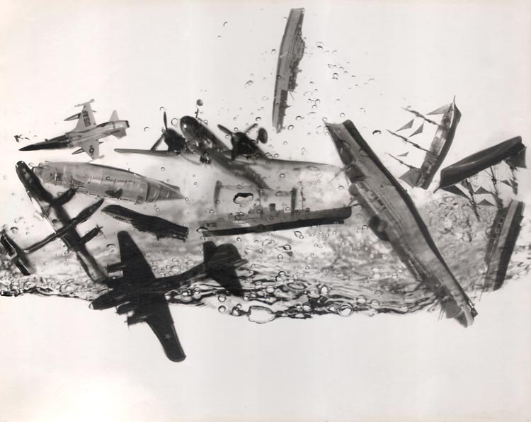
After serving in the Army in World War II – during which he painted pinup girls on the noses of combat planes, some of which you’ll find in books – my dad built a respectable career a commercial illustrator. He drew everything from cigarette ads to magazine spreads to the covers of trashy romance novels.
But by the end of the 1950s, illustration was dying fast. Magazines and publishing houses were turning to photographs instead of those antiquated, Mad Men-era line drawings.
My father decided to make the switch, and signed up for Alexey Brodovitch’s famed photography course at The New School in New York. Brodovitch, the longtime art director of Harper’s Bazaar, teacher and mentor of Irving Penn and Richard Avedon (in whose studio the course was held), is considered one of the fathers of modern magazine design. He’s credited with inventing the two-page spread—which, let’s face it, is a bit like inventing the sandwich. He was a very big deal. He was also a very tough teacher. If he didn’t like your work, he’d rip you to pieces.
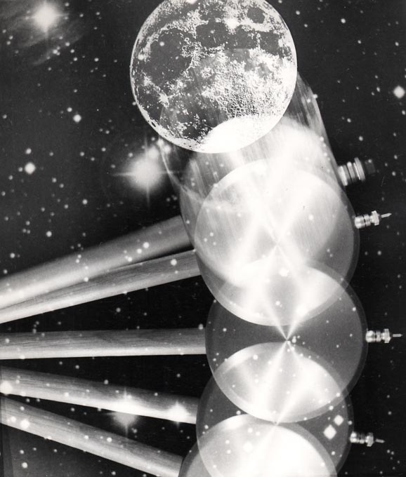
One night, in his makeshift apartment darkroom on 55th Street, my father was developing the film for his very first assignment – photos of the original Penn Station, before its demolition. He realized he’d underexposed every single frame. There wasn’t one usable image. And the class was the next day. In other words, he was toast—and so was his new career. In a desperate panic, he started layering the negatives together, to create usable images – and in the process, created moody, impressionistic montages. His life must’ve been flashing before his eyes — and at the wrong exposure.
Brodovitch loved the montages. In fact, he spent the entire class gushing over them. And on the final night of the course, he offered my father his first-ever professional assignment: to illustrate a new work by an emerging young writer, Truman Capote. The work was Breakfast At Tiffany’s. But we’ll get back to that.
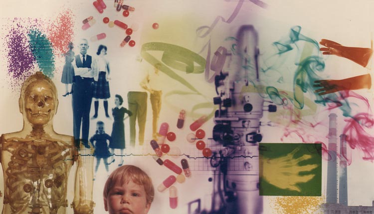
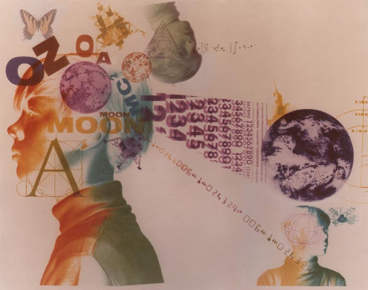
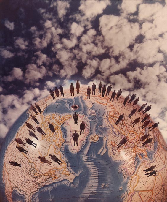
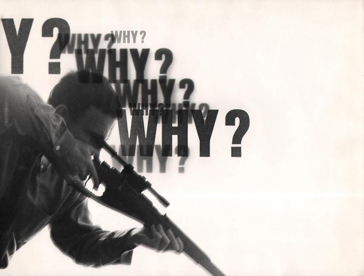
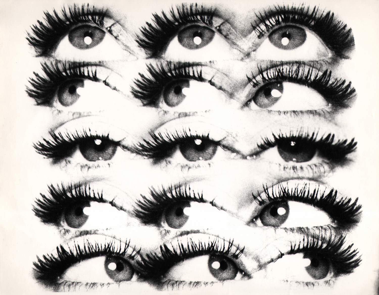
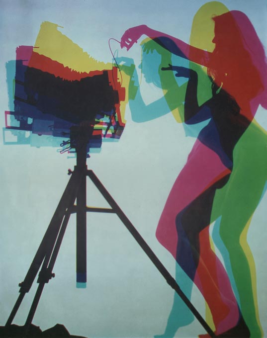
My father’s work was always wide-ranging. His straight portraiture and street photography were fantastic. But more than any other style, the montages became his voice. A way to express things that couldn’t be captured by the naked eye. A way to make photographic paper his canvass. A way to be different.
His background in illustration no doubt shaped these montages. In fact, he acknowledged this himself; he would often photograph backgrounds and foregrounds separately, and combine them in the darkroom. A standard illustration technique.
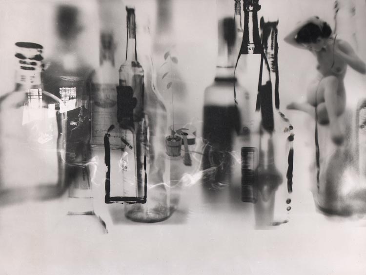
But here’s what I find fascinating: his work as an illustrator was good, but pedestrian. He never tried to experiment. He never tried to invent. He never tried to be different. Until that darkroom accident somehow freed him – to start seeing with his mind’s eye, to embrace the unusual, to use the darkroom not just to develop film, but to develop ideas.
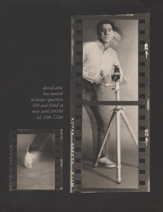
My father’s switch to photography worked out pretty well for him. He was, until his passing in the 1980s, highly prolific – he always had a camera around his neck – and his work appeared in books and magazines, on album covers, even on NYC subway posters in my childhood. He had gallery shows, published a beautiful book of his own photographs taken in the Soviet Union, Russian Self-Portraits (Harper & Row, 1977), and landed prints in the National Portrait Gallery.
But he passed away nearly a decade before the Internet. Not surprisingly, his work languished, until it pretty much vanished.
I discovered this about seven years ago when, in a moment of procrastination from my own work as a television writer, I Googled his name. Not much turned up. One of the few things that did was a blog post with two Pall Mall cigarette ads he’d drawn in the 1950s, when he was a commercial illustrator, followed by the cover of a trashy pulp novel he’d done around the same time, followed by this statement: “And for now, that’s all we know about David Attie.”
So I posted a brief comment. I said that I was a direct relative, and that, actually, David Attie became a photographer and had a great career. I signed it “Eli.”
Within a couple days, I was contacted (on Twitter, no less) by a guy named Brian Homer—a lovely man from England, who had bought my father’s book, Russian Self-Portraits, had been influenced by it, and wanted to help get his work seen again. My first reaction was: why hadn’t I ever thought of that? Weeks later, we met in New York, and along with my brother Oliver and my mother Dotty Attie (a gifted, successful painter in her own right), spent a few days rifling through the dust-covered wooden boxes that contain my father’s negatives—exactly as he left them, in the Manhattan brownstone that was his home and studio, and where my mother still lives and works.
Brian was mostly interested in the Russian self-portraits, so that’s what we looked for and organized. But I stumbled across something that interested me more: stunning studio portraits of The Band, at their peak in 1969, taken for the cover of Time magazine but never used. (Ironically, their thickly whiskered, Civil-War-troubadour look is closer to contemporary Brooklyn than anything in this book.) Being a bit of a rock obsessive, I decided to take the negatives back home to Los Angeles, where I was sure I could get them published and exhibited and permanently enshrined in popular culture.
Two things happened right away: 1) I left the negatives in a taxicab (and quickly recovered them, thanks to a high school pal who happened to be the Deputy Commissioner of Transportation); 2) Nobody cared that I had a few rolls of film by a long-dead photographer.
Actually, that’s putting it mildly. I couldn’t even get gallerists and curators on the phone for general advice. Hollywood may be a tough town, but at least people will ignore you over coffee. Brian’s luck wasn’t any better. Finally, a prominent rock photographer told me: “You need more famous people. Gather any pictures your father took of famous people. That’s the only way anyone’s ever gonna care.” On my next trip to New York, I went back to the dust-covered wooden boxes.
That’s when I found a small manila envelope labeled “Holiday, Capote, A3/58.” Now, I knew that my father had photographed some notables in his time—including Bobby Fischer and Leonard Bernstein and Lorraine Hansberry—but I had no idea he’d ever been near Truman Capote. And when I had the negatives printed, my jaw hit the floor. These were the coolest pictures of Capote I’d ever seen, framed like shots from a Hitchcock movie. The still young, steely-eyed scribe looks like he’s creating his own mythology right in front of the camera.
How had I never seen these before? How were they not hanging in major museums, let alone sitting unseen in a dust-covered wooden box?
Fortunately, Capote has a very healthy Internet presence. And with some help from my father’s writings and my mother’s recollections, I was able to piece together the story of these photographs, and exactly how my father’s career had intersected with and in some ways been birthed by Capote’s.
As I mentioned, it was Brodovitch who gave my father the job of illustrating Tiffany’s for its debut in Bazaar. He worked around the clock for almost two months to complete the job.
Meanwhile, the Hearst Corporation, publisher of Harper’s Bazaar, was having second thoughts about Breakfast at Tiffany’s. This was, after all, a story about a woman who slept with men for money. Not to mention, Tiffany’s was a major advertiser in Hearst magazines. The publisher wanted changes to the novella. Alice Morris, the fiction editor of Harper’s Bazaar, has said that while Capote initially refused, he relented “partly because I showed him the layouts… six pages with beautiful, atmospheric photographs.” (I’ve since found all the original Breakfast at Tiffany’s work, and Capote was right. Not bad for a first-timer indeed.)
Capote made all the changes, but Hearst told Harper’s Bazaar not to run the novella anyway. Capote then resold it to Esquire, accompanied by one full-page montage of my father’s. It flew off newsstands and rightfully made Capote a star. Everyone loved my father’s work too, and in his words, “my new career was launched.”
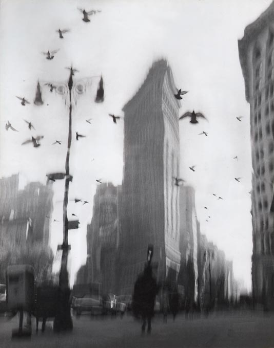
A couple of months later, the magazine Holiday asked Capote to write an essay, which he would entitle Brooklyn: A Personal Memoir. I can only guess that Capote himself recommended my father to illustrate it, but there’s no way to know. Sometime in March, 1958 (at least I think “A3/58” means March), they spent a full day together. First, my father took portraits of Capote and some shots of the house on Willow Street that he called home. Then Capote led him around Brooklyn Heights and what is now Dumbo, showing him favorite haunts and local characters. My father spent few days photographing the neighborhood on his own. Their work ran in the February 1959 issue of Holiday.
I managed to find a copy on eBay, and couldn’t wait to see which Capote pictures the magazine had used. To my amazement, Holiday used only four of the neighborhood shots—and not a single picture of Capote himself.
I’m embarrassed to admit that, even after seeing them in print, I wasn’t especially interested in the neighborhood shots; I didn’t even take those negatives out of their thickly stuffed envelopes. My mandate, after all, was to gather pictures of “famous people.” I was starting to get some interest in them, and the Capote portraits were many people’s favorites. When I learned that the original Capote essay had been turned into a small book in 2002—without any of my father’s work—I sent an email to the publisher, The Little Bookroom, through the “contact us” link on its web site. I suggested that my unseen shots of the very famous author might be useful for a second edition. And did I mention that he was famous?
I started corresponding with the publisher, Angela Hederman. She asked to see the neighborhood shots, which I still hadn’t looked at myself. I scanned them, about eight hundred of them, on a home office scanner and barely even looked at them. A day or two later, she replied: “I think we have a photo book!”
Only then, in my dumbfounded amazement, did I take a good look at the images that became this book and realize: hey, these are even better than pictures of famous people.
The book (Brooklyn: A Personal Memoir by Truman Capote, With The Lost Photographs of David Attie, The Little Bookroom, 2015), came out to terrific reviews, and probably more press attention than a little art book deserved. Then Getty Images started licensing his work. Then my dad had photo-essays in Vanity Fair and Slate, profiles in the New York Times and The Independent, portraits in numerous major documentaries, and an 18-month show at the Brooklyn Historical Society – as well as shows in LA and Englabnd. This year alone, there will be a show at Keith de Lellis Gallery in New York in the Spring, and a new book of his Sesame Street photos, taken during the show’s very first season (available from Abrams in December).
What’s still fascinating to me is that much of the work that has gained attention in recent years is straight photography – portraits and streetscapes — as opposed to the montages he wanted to be known for.
My father once wrote, “My first impulse when I started out was to do battle with photography, to produce images that were anti-photographic. I have never made peace with photography in its simplest expression. I feel the need to interfere in some way with the making of a photograph. I don’t seem to have the ability to leave things alone. It only seems to work for me when I complicate the endeavor. The ideal photograph for me is one that cannot be seen in a viewfinder or even in nature.”
The truth is, he was great at every style and genre. Plenty of the work that he thought was barely worth seeing is extraordinary – leaps and bounds beyond his work as an illustrator, which he acknowledged was “never outstanding in any way.”
It took a technical mishap to unlock his true brilliance. And there’s a lesson in it, one that I think it applies to anyone doing creative work. Who needs to invent Photoshop? The real task is to invent yourself.
David Attie: Visual Communication is on at Keith de Lellis Gallery, NYC, March 18 – May 27, 2021. www.keithdelellisgallery.com